We created Frutera — a joyful, juicy name that sounds natural, fruity, and fizzy all at once. Easy to say, easy to remember, and perfect for kids, families, and summer days.
Visual Identity
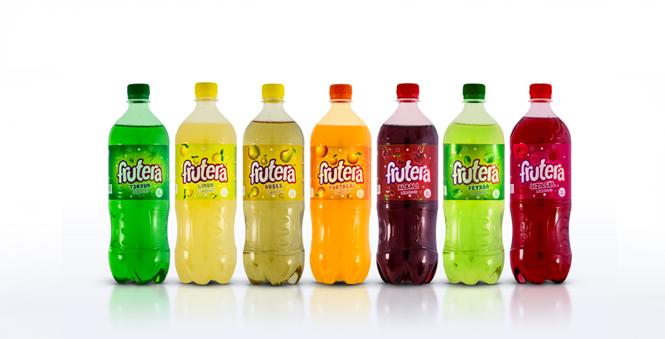
The Frutera logo was crafted with chunky, rounded, bouncy typography, full of energy and movement. The letterforms feel juicy and fun, almost like soft fruit drops. A purple-to-red gradient outline gives the wordmark a dynamic pop, creating an identity that feels bold, vibrant, and ready to jump off the shelf.
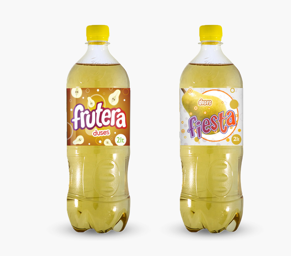
Packaging Design
Each flavor was color-coded and paired with vibrant fruit visuals and fizzy graphic bubbles that visually connect fruit and carbonation. Key visual decisions included:
- A splash design behind the logo to suggest a fruit explosion
- Floating bubbles around the fruit to reinforce the fizzy refreshment
- Clean and modern flavor naming in large font for easy recognition
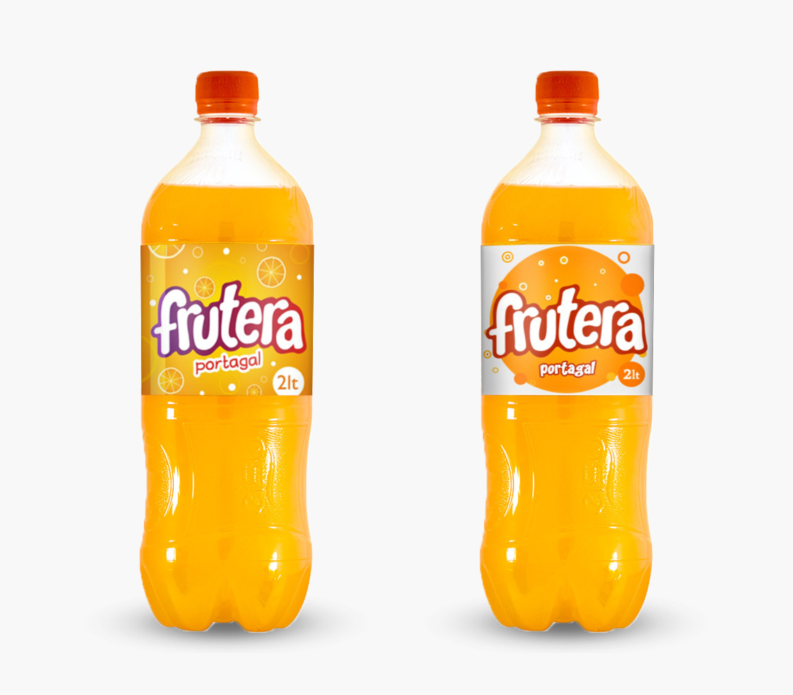
- On the premium line: a more golden palette with texture dots to suggest richness
The Frutera Premium range also received its own design twist — including a creamy splash design around the logo and subtle flavor visuals that elevated its taste expectations while keeping the brand's fun spirit intact.
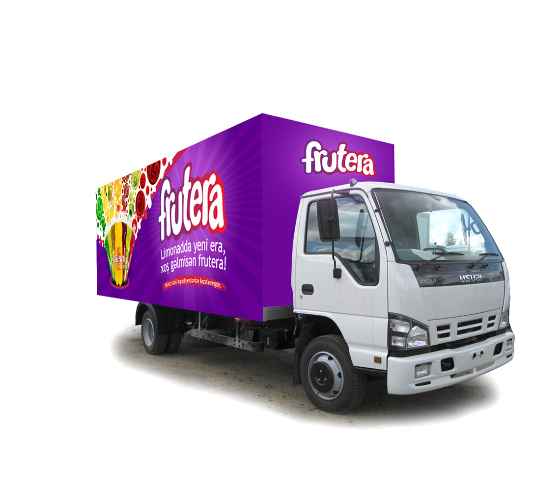
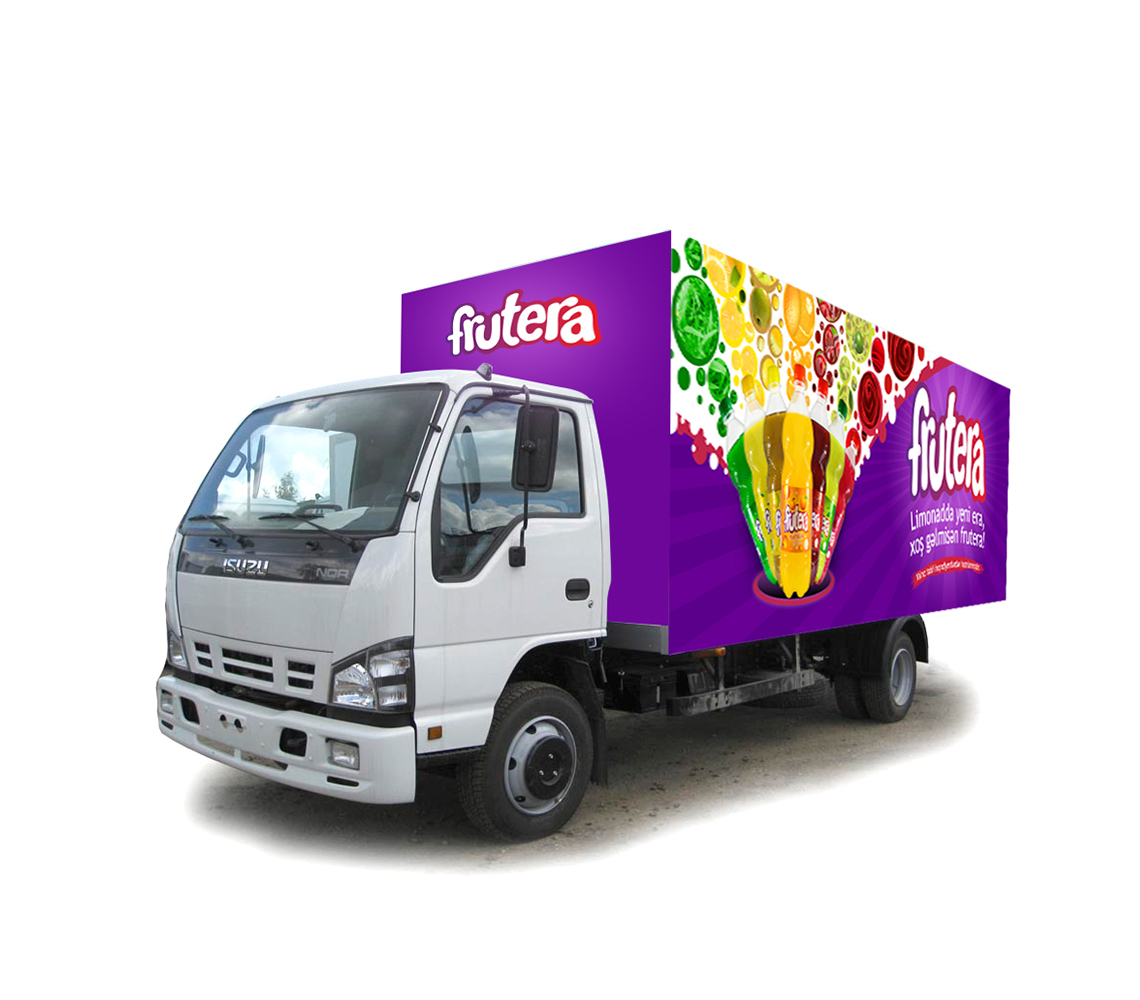
Vehicle and Outdoor Design
We expanded the visual identity into delivery truck branding and billboards. Giant fruit visuals, oversized bubbles, and playful typography helped ensure that the brand message — Frutera = fruity fun + refreshing fizz — was instantly clear at any distance.
The trucks became rolling brand ambassadors, taking the visual joy of Frutera into neighborhoods, markets, and city streets. Outdoor ads focused on vivid flavor blocks and playful calls-to-action, keeping the tone light and energetic.